


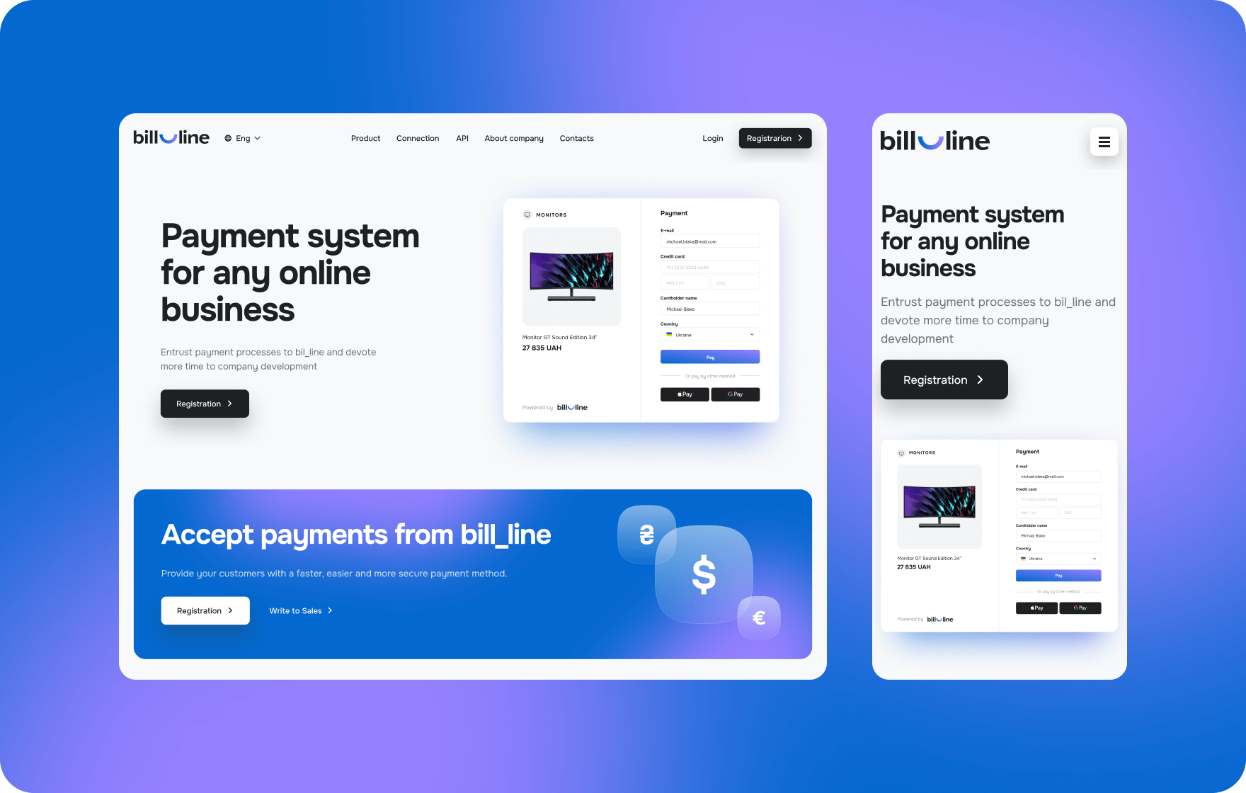
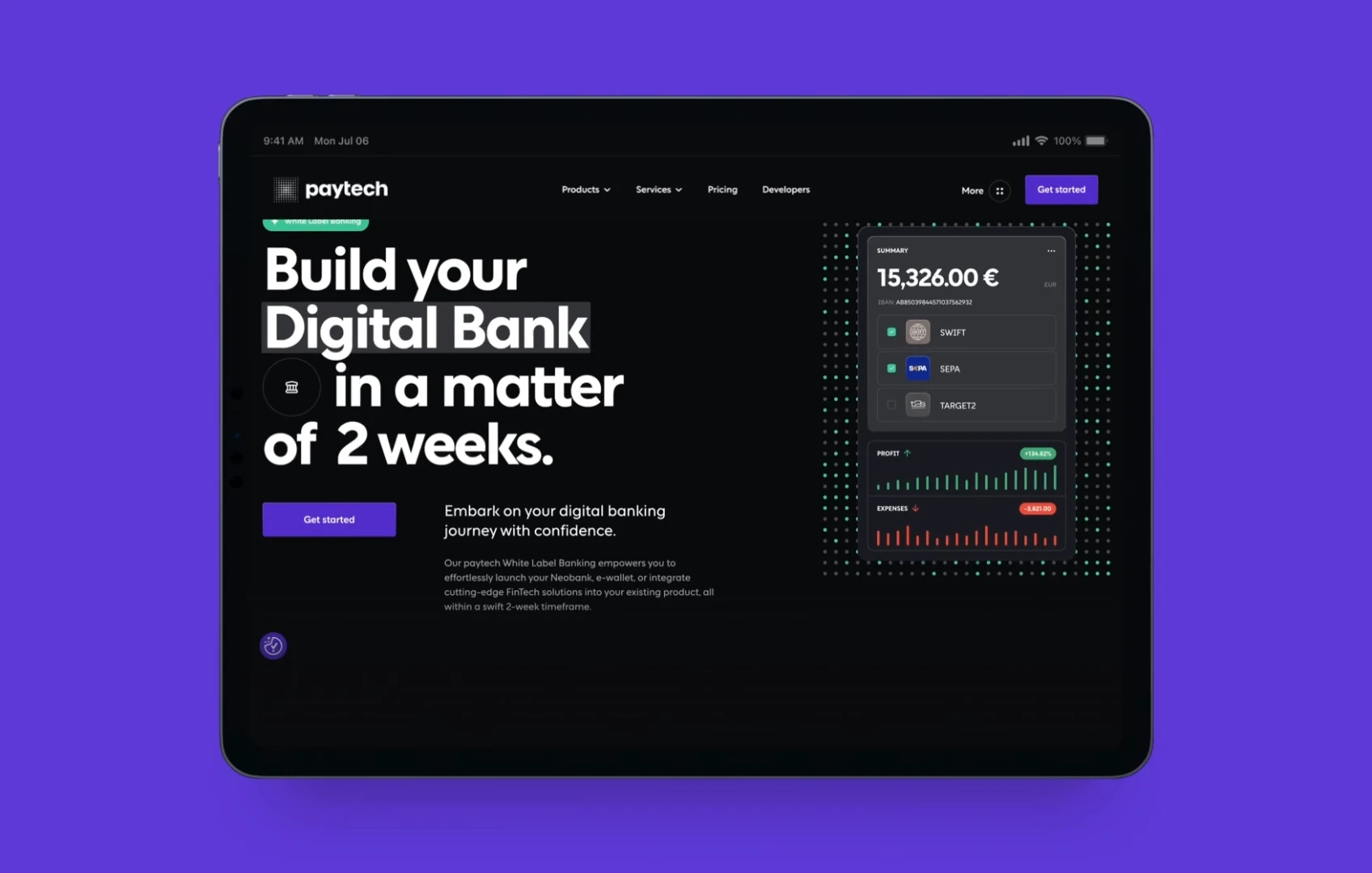
FinTech lives where tech meets money, and in this space, a strong online presence isn’t just nice to have—it’s mission-critical. A generic website won’t cut it. You need a platform built to convert, instill trust, and keep users engaged from the first click.
Because when money’s on the line, people don’t gamble. If your site doesn’t immediately communicate credibility, security, and ease of use, visitors will move on — fast.
How to Build a FinTech Website That Delivers
Let’s get into it. After years of working with top FinTech brands, Goodface FinTech design agency distilled the must-follow principles for building a site that not only looks good but drives real results.
1. Make a discovery first
Discovery is the cornerstone of everything, not just a box to be checked. You must thoroughly examine user behavior, market trends, and company objectives before you design a single pixel or write a single line of code. You’re just making costly guesses if you skip this.
The priorities of each kind of FinTech website vary. An SEO-driven structure is essential for marketing websites. Product websites need to clearly display features. Websites for businesses should exude honesty and trust. Without discovery, you run the danger of falling short, which is an expensive error in the FinTech industry.
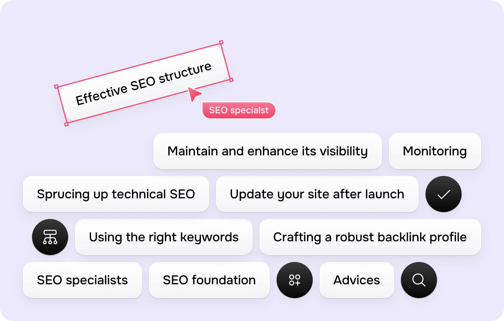
2. SEO Isn’t an afterthought
SEO isn’t just about ranking higher on Google — it’s about making sure the right people find you when they need you most.
By increasing organic traffic, a strong SEO strategy lessens your reliance on sponsored advertisements. However, it’s not just about keywords; technical SEO, site speed, and content organization are all very important. If you do this correctly, you may reduce acquisition expenses and increase the visibility of your FinTech website over time.
3. Know your competition — then do better
Study the industry leaders. What works? What’s missing? What’s standard? Your goal isn’t to copy but to find opportunities they’ve overlooked.
- Focus your competitor analysis on:
- What design patterns users trust (and what they don’t).
- How conversion funnels guide users to action.
Their positioning — how they stand out, and how you can stand apart.
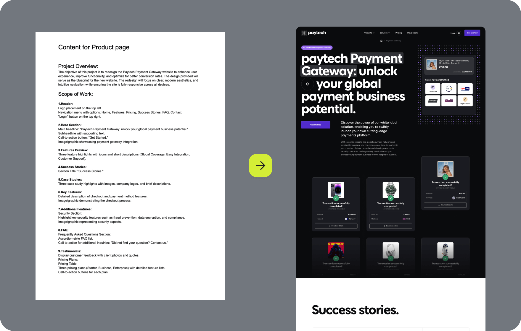
 4. Prioritize what actually matters
A FinTech website should spotlight its core product. No distractions, no fluff — every page should have a clear purpose.
Before adding a feature, ask yourself:
- Does it help users understand the product?
- Does it build trust?
- Does it remove friction?
If the answer is no, cut it.
5. Design for users, not just aesthetics
A beautiful interface means nothing if the experience is frustrating. Map out user flows, remove friction, and make interactions seamless. Every unnecessary step is a chance for users to leave.
Some visitors want in-depth financial insights. Others just need a smooth, effortless experience. A well-designed site caters to both.
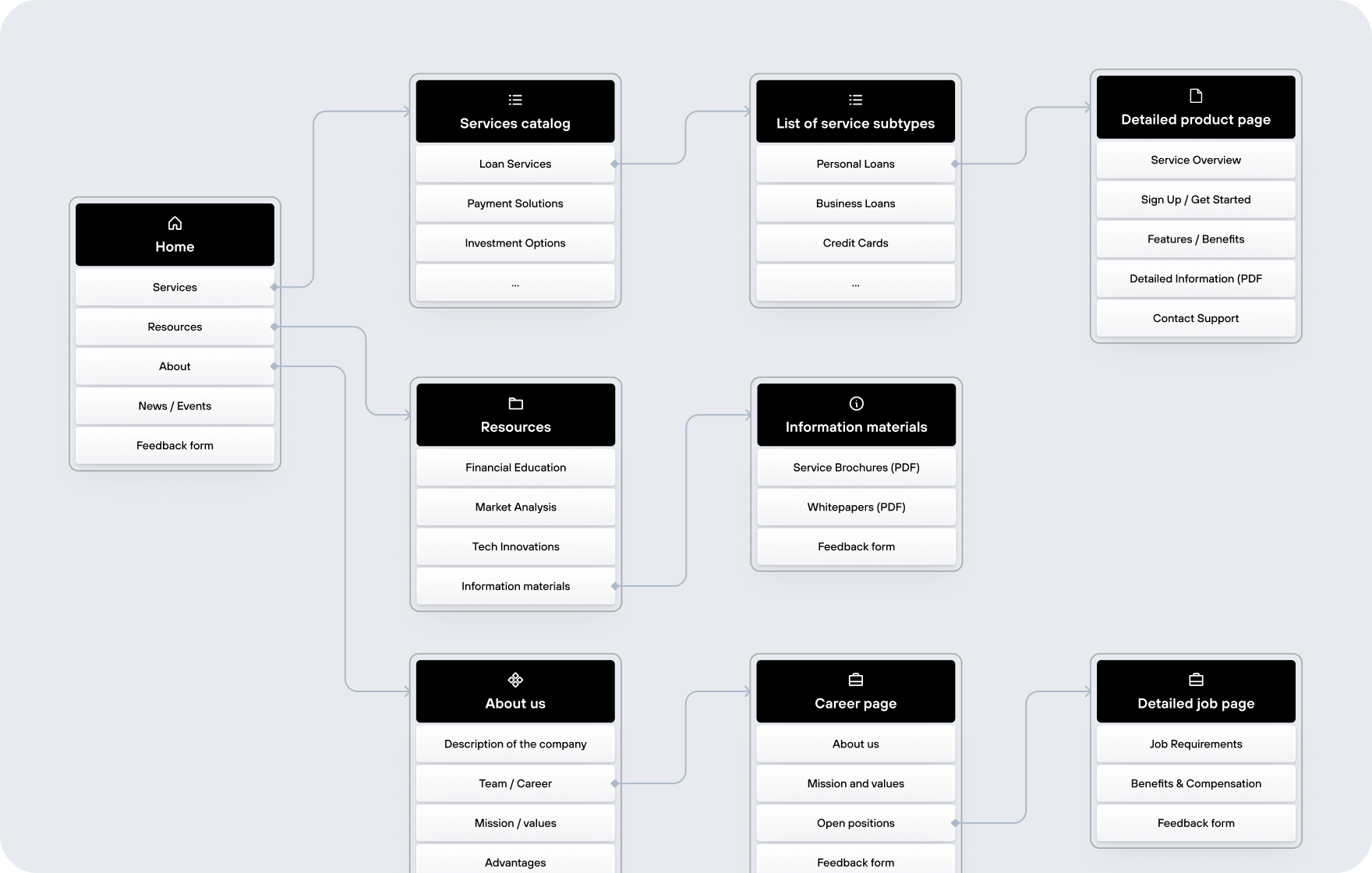
6. Make navigation effortless
Users won’t dig for information. Structure the site so they can find what they need instantly. Every click should serve a purpose.
Your navigation should be crystal clear — not something users have to figure out.
7. Content should be sharp, not stuffy
Financial jargon? Hard pass. Your content should be crystal clear, actionable, and to the point. Break down complex concepts and always lead with value.
Users don’t need a degree in finance — they need to know:
- How your product works.
- Why they should trust you.
- How to get started.
- Keep it short. Keep it engaging. Boring content doesn’t convert.
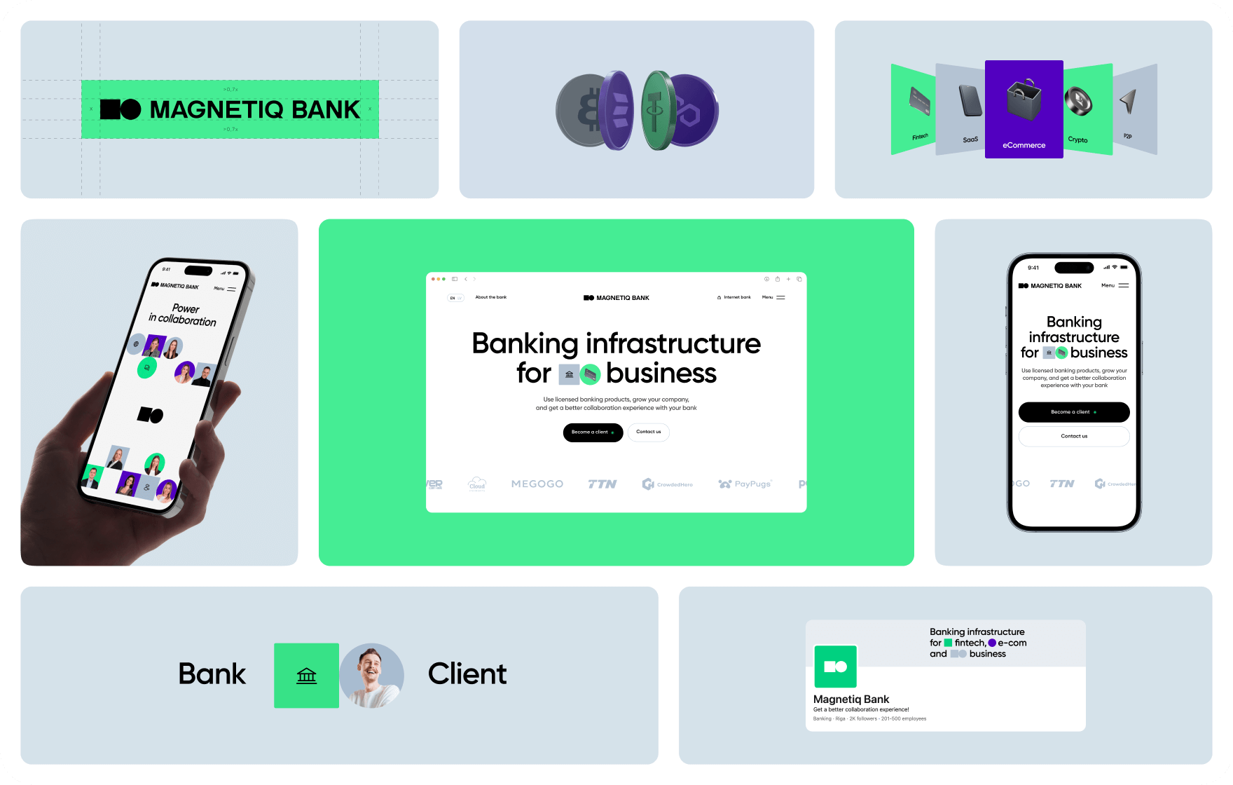
 8. Visual identity matters — a lot
Your website should instantly communicate who you are. The best FinTech website design blends industry credibility with modern aesthetics. Find your distinct visual style and own it.
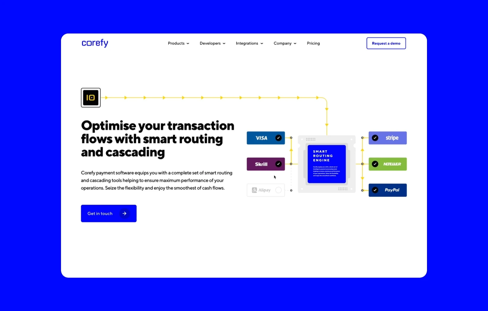
9. Use visuals to simplify, not overwhelm
Finance can be dense — your website shouldn’t be. Infographics, interactive elements, and illustrations make complex ideas easy to grasp.
If your site reads like an economics textbook, start over.
10. Mobile-First. No exceptions
If your website isn’t seamless on mobile, you’re losing half your audience before they even get started.
Mobile users won’t wait for slow load times or wrestle with clunky navigation. They’ll leave—and they won’t come back.
11. Motion & micro-interactions: make it feel alive
Subtle animations, hover effects, and transitions add depth and guide users naturally.
Motion should have a purpose:
- A loading animation that reassures.
- A hover effect that draws attention to a particular activity.
- A transition that makes navigation effortless.
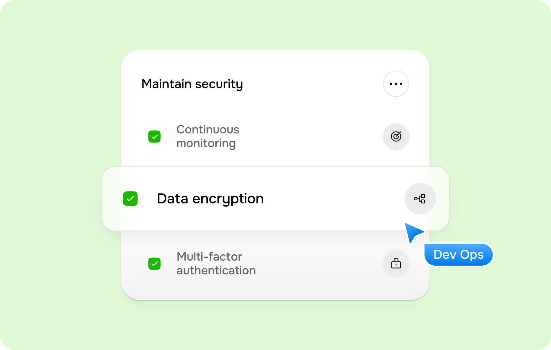
12. Security should be obvious, not assumed
Encryption, fraud prevention, compliance—don’t just implement security, make it visible.
Users don’t just need to be safe; they need to feel safe. That means:
- Clearly stating security measures.
- Displaying trust signals (compliance badges, regulations, certifications).
- Making transactions and data handling feel airtight.
The bottom line
There’s no one-size-fits-all formula, but a top-notch FinTech website nails three things: clarity, trust, and frictionless UX.
We’ve broken down top FinTech strategies and uncovered 30 UX/UI hacks designed to boost conversions. Download our free PDF FinTech eBook and check them out.
So — define your goals. Sharpen your strategy. Put these insights to work.
And remember: your website isn’t a set-it-and-forget-it deal. Keep testing, optimizing, and evolving. That’s how you stay ahead.
All the photos in the article are provided by the company(s) mentioned in the article and are used with permission.
Disclaimer: This article contains sponsored marketing content. It is intended for promotional purposes and should not be considered as an endorsement or recommendation by our website. Readers are encouraged to conduct their own research and exercise their own judgment before making any decisions based on the information provided in this article.

")


