by Nicholas Rubright
Almost every marketing collateral – especially when it comes to digital marketing – contains a call to action (CTA) for the viewer. A CTA is an invitation to the user to take the desired action, such as visiting a website, subscribing to a newsletter, or making a purchase. These actions are instrumental in converting leads into customers.
However, not all CTAs succeed in getting the user to convert. One marketing company, Leighton Interactive, discovered that users clicked on CTAs just 4.23% of the time. The click-through rate (CTR) also varied across industries, with finance, logistics, and ecommerce brands generating the highest CTRs.
If 4.23% seems too low for you, there are different ways of optimizing your CTAs to maximize conversions. Let’s discuss some best practices you can apply to your CTA design and look at some examples of effective CTAs that follow these methods.
6 tips to help you write effective CTAs
Running a business is a bit more complicated than finding great products to sell online and hoping people will buy them. Getting people to visit your website is challenging on its own. Once you manage to generate traffic, getting users to make a purchase or sign up for a service is another challenge you’ll have to solve.
Your site content has to be more than just engaging, grammar-checked, and informative. It has to give the visitor that extra nudge to complete the sale or take the desired action. Creating effective CTAs will help you improve conversions and increase your revenue. Marketers follow a set of industry best practices to get users to click on CTAs. Here are some of those practices:
Use the right color
Marketers have known about the ability of colors to evoke emotions and spark actions for some time now. Red, for instance, represents passion, excitement, and a sense of urgency. In contrast, green is calming and relaxing.
However, in an article published in CXL, marketing expert Ott Nigulis argued that the color of the CTA matters less than the way it contrasts with its background, as well as the context in which the color is used.

The example above shows us the difference between a green CTA button and a red CTA button. Because green is a “cool” color, the button on the left doesn’t stand out from its background. The red button, on the other hand, jumps off the page and is likely to generate more clicks.
If you want to use colors to call attention to a CTA button, you need to consider the background color. For instance, when web designers use a white background, they often use blue buttons and white text. However, you can pick other color combinations to increase click-throughs. Let’s look at the HelloFresh marketing email to see color combinations in action.
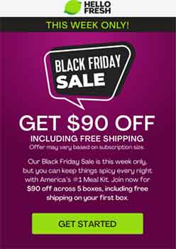
If you recall your color theory lessons in art class, you’ll know that green and purple are what we call “complementary colors”, or colors that go well with each other. In addition, the specific shade of green used in the CTA is consistent with the brand’s logo.
When you select color schemes for your CTA buttons, you’ll need to consider your branding and the action you want to trigger. You’ll also need to think about how the design will impact your website or email’s overall user experience.
Create urgency with text
Your CTA button doesn’t exist in a vacuum. You need to surround it with different elements, including images and written copy, to maximize its effectiveness. Analyzing your customer persona will help you understand what will work with your audience. For instance, using your copy to create a sense of urgency can boost click-through rates dramatically.
The email from Instacart below is a good example of a CTA that uses the emotion of urgency to convince the user to click through:
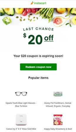
As a reader, I couldn’t care any less about the popular items. What I care about, though, is the fact that I have a $20 coupon that I need to use right away before it expires. Thankfully, the CTA button in the email offers a way for me to use that $20 coupon on anything I want as long as I buy it through Instacart. It’s campaigns like these that make Instacart one of the best-performing ecommerce sites.
Offer a free trial or cashback
We looked at how discounts can get people to take action. How about offering a free trial or a cashback? Both of those also add value to consumers’ purchases. Since they add value, people will explore the offer at the very least. At best, a free trial will convince the user to try the product before they commit to spending money on it.
Look at how CoSchedule invites its email subscribers to try the software free of charge:
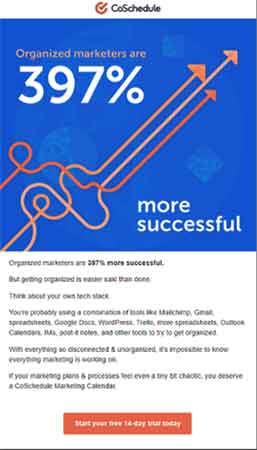
Make sure what you offer, though, is enough value that consumers will take your desired action. If you offer a free trial of your product but don’t give them access to those features that matter, that strategy might just backfire on you. The example above claims to give users a way to organize their marketing plans and processes.
Use large text
No matter how much of a build-up you give, your CTA button will work only if the potential consumer notices it in the first place.
Do you see a CTA button in this image?
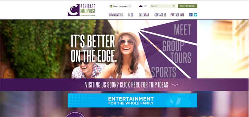
It’s right there in blue, but it’s barely noticeable. If you’re new to the page, you’ll think it’s just another part of the banner ad. There’s nothing in there that says “Click here!”
The text of your CTA should attract and beckon your consumer. It should also indicate what you want the user to do with it. Color contrast is one of the ways to do this. However, it’s much easier to use clearer text and increase the font size:

The CTAs from PrepScholar, an graduate school application platform, tell the user about their offer in a straightforward manner. They also literally stand out from the background and the copy because of the bigger font size. When you hover your mouse pointer over the buttons, you already know what to expect, which increases your chances of clicking on them.
Focus on button shape
Pay attention to your CTA’s button shape, too, because it can help drive action.
According to Ukietech, some people ignore irregular-shaped buttons because they perceive those as a threat. Unobtrusive buttons, it said, perform better. Some, however, say CTA buttons that have unique shapes perform better because they stand out on the page.
A CTA in this shape, for instance, aligns with the business.
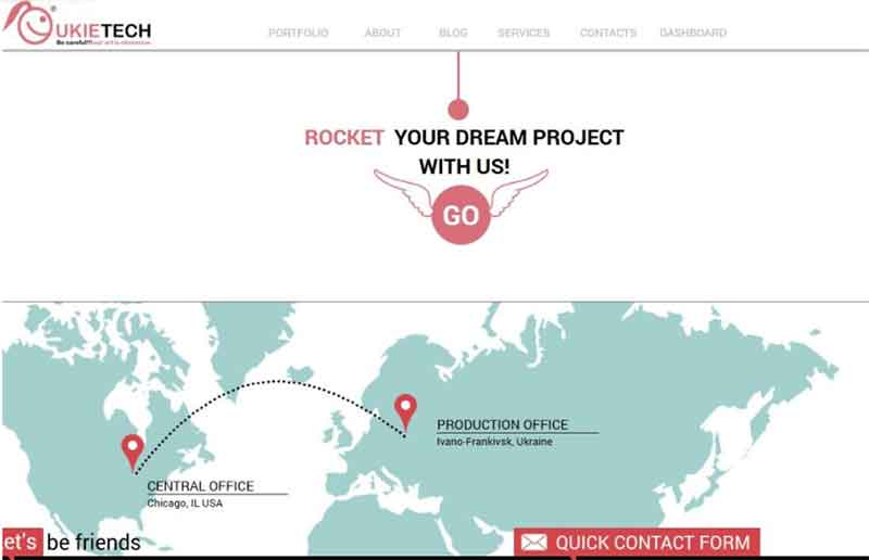
I actually think the button from the CTA above is amusing. Not only does it tell me what to do (go places with my brand); it also allows me to visualize how Ukietech will take my brand to the next level. While I’m sure it doesn’t involve wings or flight, the wings on the CTA grab my attention and make me want to click through.
There are no hard and fast rules for CTA button shapes. Try out different shapes and see how people react. If a specific shape generates more clicks, make that change permanent.
Test your CTA
I’ve given you five tips so far. Remember, though, that what works for some may not work well for you. That’s why you still need to conduct A/B testing on your CTAs. An A/B test simply involves creating two different CTA examples and using them on controlled groups to see which one gets a better response.
Testing your CTA doesn’t mean you can overhaul the appearance of your CTAs in just one move. A/B testing requires you to do the changes one at a time. For instance, you can test two different colors but not change the text, and vice-versa. You also need to test your CTAs on different platforms and devices as the way they display your CTAs might vary.
You can easily test your CTA using a landing page builder or a sales funnel builder. Testing your design and copy is an easy way to boost sales or conversions.
4 CTA examples to learn from
Creating a strong CTA is more than just writing actionable sentences. It’s more about what leads up to the action. Check out these four examples of great CTAs so you can get a few pointers on how to create yours.
KlientBoost
This marketing agency specializes in PPC on social media. They have a simple enough CTA – GET YOUR FREE MARKETING PLAN. Notice that they don’t even tell the consumer to book an appointment right away.

But the text above is attention-grabbing – A marketing agency that breaks things? Definitely worth a second look. The free marketing plan, with its 17+ marketing ideas, almost sounds too good to be true as well.
Considering that KlientBoost’s target audience is SMEs, a free marketing plan is nearly impossible to resist. If that isn’t already a good enough reason to click through, the CTA also contrasts strongly with the white background, generating even more clicks.
Bulletproof
You might know this brand from their butter-infused coffee. However, this e-store also sells sugar-free health products. The home page below emphasizes that fact through strong, attention-grabbing copy laid out in contrasting colors:
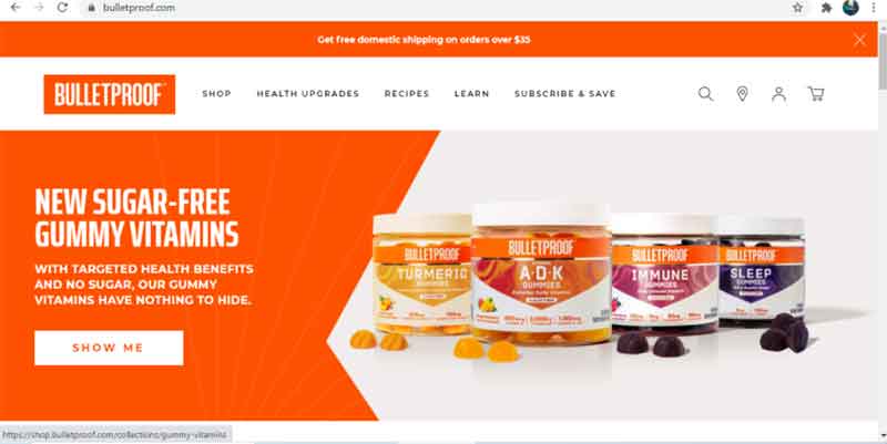
In addition, the highly-visible CTA button itself uses the first person. Instead of saying “Buy Now”, it says “Show Me” which is less of an invitation from the brand and more of a command issued by the user. The brand emphasizes the value of taking charge over one’s health, and the CTA button allows the user to make the decision to know more about healthier vitamin supplements.
Elementor
With the world going online, almost everyone wants to build a website or eCommerce store. Inviting them to do so for free is the best invite ever.
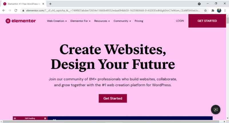
Notice how Elementor goes a step further and says Design your Future? That’s just the hook. They reel in their audience by telling them their fate will depend on whether or not they choose to click on that CTA.
Then they tell users they’ll get lots of support in designing and coding to remove any doubts they might have about clicking the button. With more than 8 million Elementor users, the brand invites new subscribers to join a global community of web designers and other online professionals.
Juvia’s Place
Juvia displays all her products on a slider. Right below that, she announces her sale. Above the products, she informs visitors she’s restocked on her products and tells them there’s free shipping.
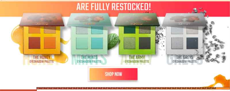
Overall, it’s a great strategy to get visitors to click on the CTA. Who doesn’t want to know they can pay less for more? In addition, who doesn’t like to know there are a lot of new products to choose from?
The only thing left to do, then, is to click on “Shop Now.”
In Closing
CTAs are just as important as any of your other marketing assets. In fact, they may be even more important because they can influence the direction your business takes.
Good CTA design is anchored on improving the user experience. A CTA is supposed to do more than just getting the user to click. It should also educate, offer options, and let the user take charge of their decisions. The tips I shared above will help you create CTAs that convince site visitors that clicking through will help them achieve positive results.
The CTA is an important part of sales funnels. It is the doorway to your e-store or website. Do it the wrong way, and you’ll be way behind the competition. Do it the right way, and you’ll drive people to action and propel your business to success.
About the Author
 Nicholas Rubright is the communications specialist for Writer, an AI writing assistant designed for teams. Nicholas has previously worked to develop content marketing strategies for brands like Webex, Havenly, and Fictiv.


